Note: make sure you get to the very end of the blog to see the final reveal picture!
In a typical kitchen renovation, the project is kicked off with demolition of the existing kitchen followed by the installation of most, if not all new elements including cabinets, appliances, countertop, backsplash, flooring, sink(s), faucet(s), etc. Often, the layout is also reconfigured to improve the efficiency and workflow in the room. Sometimes, the overall dimensions of the kitchen are increased. These are all standard practice in kitchen renovations.
Recently, we completed a different kind of kitchen update that we coined a kitchen “reNEWvation” – a unique approach to a renovation that did not include the traditional demolition and reinstallation approach. Let’s explore this kitchen reNEWvation project!
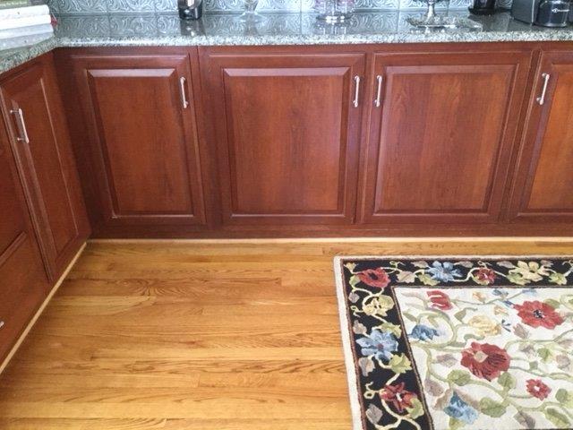
We were revisited by past clients that presented us with an exciting challenge: their primary goal was to make their entire first floor less traditional and more transitional, all while boycotting the traditional demo and reinstallation process. They loved the convenient layout of their kitchen and their cabinets were in very good shape, but the room looked dated. We got right to work!
One of the first steps we took was to refinish the hardwood floors with a stain that was more contemporary than their standard brown oak floors, followed up with an update of the recessed lighting throughout.
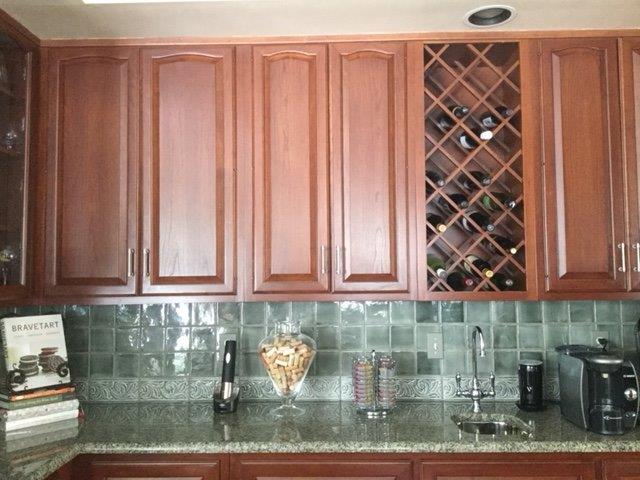
They had recently purchased stainless steel appliances so that was a large expense that would not need to be incurred with this project. Their kitchen was large and included a main kitchen area with an island and another area of cabinetry on the other side of the island (shown above), so they did not want to have to replace their existing granite and backsplash.
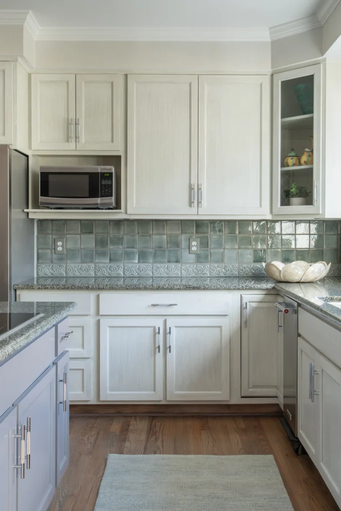
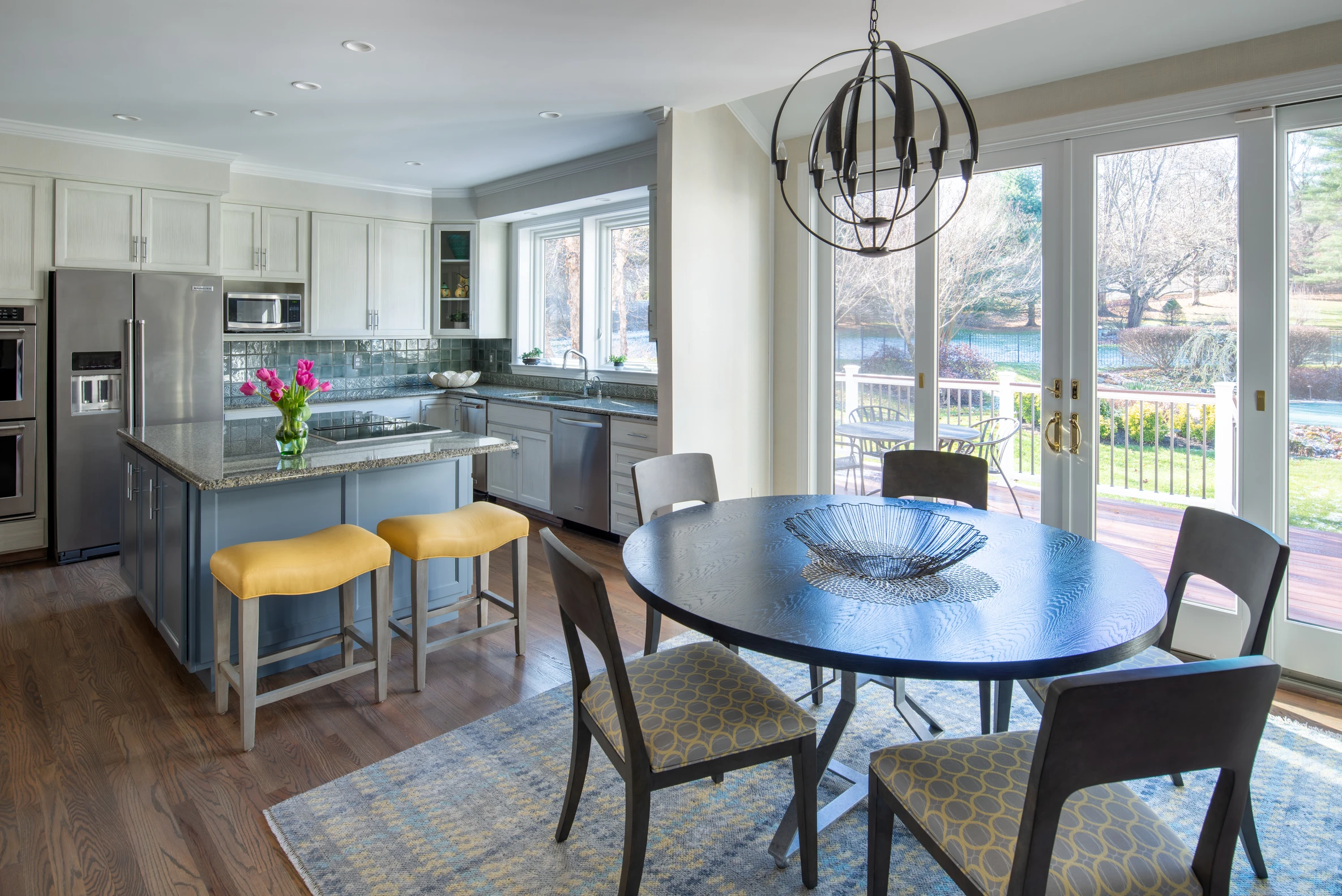
As we moved into the planning stage of the project, we knew we would work with the existing cabinetry, counters and backsplash. The counters and backsplash were gray-green in color, so that became our starting point for the kitchen palette. The cabinets had traditional paneled doors and drawers, so in order to truly update this kitchen we ordered new ones in a shaker style. Next, we worked with the decorative painters at Billet Collins and decided upon a light gray-green vertical strie finish for the panel of the doors, and a complementary solid paint for the stiles and rails and the cabinet fronts. The island was painted in a darker gray shade that made it stand out from the rest of the cabinets. The walls of the kitchen and adjacent family room were painted in a shade that coordinated with the cabinetry.

Next, we designed a kitchen table with a funky geometric metal base and a charcoal stained walnut top that was crafted by Michael James Furniture. The kitchen chairs were purchased through Century Furniture and the counter stools came from Charles Stewart Furniture. We decided to make the upholstery fun while introducing the color yellow into the mix. The chairs were upholstered in a grey fabric with yellow circles on it and the counter stools received a heavy duty yellow vinyl. The breakfast area was softened with a rug that also picked up the yellow in a traditional menswear plaid with non-traditional colors. A complementary runner was used in the sink/cooktop area to add some softness to that area as well. Rugs help to provide some personality in a kitchen and also provide softness underfoot. We selected a round statement light fixture in a dark smoke finish to go above the round breakfast room table. And last, but certainly not least, the cabinets received brand new contemporary knurled handles in a stainless steel finish. This completed our reNEWvation and our clients are very happy.
Voila! A brand new kitchen without the price-tag of a brand new kitchen.


